
Bedroom color palettes that help you sleep
By RivAI Team · · 5 min read
The short answer
The calmest bedroom palettes are muted, low-contrast and matte: soft sage, dusty blue, warm greige, lavender-gray, or a deep navy and charcoal if you like a cocoon. Keep saturated colors to small accents, add blackout lining and use warm dimmable bulbs around 2700K. Color sets the mood; it is not a sleep treatment.
Can wall color actually help you sleep?
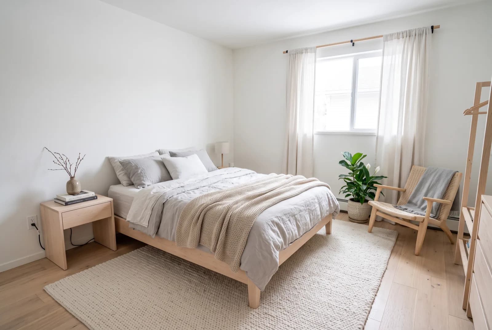
Let's be clear up front: paint is not a sleep treatment. If you have ongoing trouble sleeping, talk to a doctor, not a paint store. What color can do is make a bedroom feel calm and restful, a room that signals the end of the day instead of competing for your attention. That is worth getting right, and it comes down to a handful of things you fully control: contrast, saturation, finish, darkness and light.
A restful bedroom is not one color. It is low contrast, matte walls, real darkness and warm light working together.
What makes a bedroom color feel calm?
- Low contrast: walls, bedding and furniture within a few shades of each other. Stark white trim against dark walls keeps the eye busy.
- Muted, desaturated hues: colors with gray or brown in them, like sage rather than kelly green, read softer at night.
- Matte or eggshell finish: flat finishes don't bounce lamp light into glare spots. Save satin for trim and doors.
- Real darkness: blackout-lined curtains, mounted 4 to 6 inches (10 to 15 cm) above the frame and 8 to 10 inches (20 to 25 cm) past each side to block light leaks.
- Warm, dimmable lighting: bulbs around 2700K on dimmers, with bedside lamps doing the evening work instead of a bright overhead.
- Saturated color in small doses: a mustard cushion or a terracotta vase is fine; a whole wall of it is not.
Which bedroom palettes work best?
Here are five palettes, each with five hex codes. Use the lightest color on the walls, the mid-tones on bedding and upholstery, and the darkest on furniture, frames or a headboard wall.
Soft sage
The easiest win. Gray-green pairs with every wood tone and looks good in both daylight and lamplight.
See these colors on your own walls: Try this palette in RivAI
Dusty blue
Blue with gray mixed in. Keep it dusty, not bright, or it turns chilly and nursery-like.
See these colors on your own walls: Try this palette in RivAI
Warm greige
For people who want neutral without the hospital feel. Pairs naturally with a zen bedroom look.
See these colors on your own walls: Try this palette in RivAI
Muted lavender-gray
Purple with most of the color drained out. In warm lamplight it reads soft gray with a hint of dusk.
See these colors on your own walls: Try this palette in RivAI
Deep moody navy and charcoal
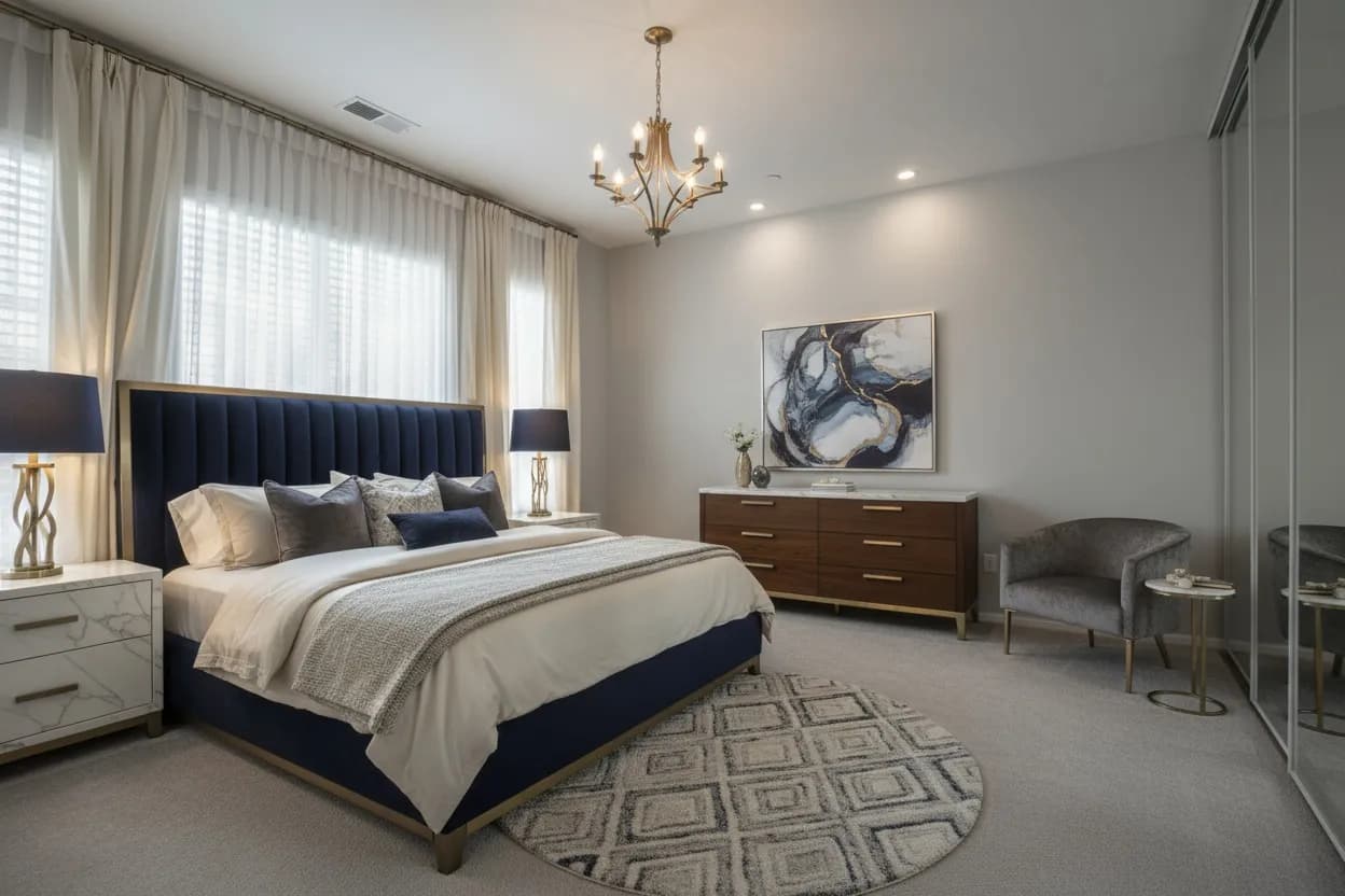
Only for rooms with good daylight and people who like a cocoon. Paint walls and ceiling dark to avoid a hard line overhead, and keep bedding mid-tone so contrast stays low.
See these colors on your own walls: Try this palette in RivAI
Should north-facing and south-facing bedrooms use different colors?
Yes. North light is cool and indirect, so it pulls colors toward gray and blue. In a north-facing bedroom, lean into the warm greige or sage palettes and avoid icy blues; our guide to paint colors for north-facing rooms goes deeper. South light is warm and strong for much of the day, so cooler hues like dusty blue and lavender-gray stay balanced instead of turning yellow. East and west rooms shift through the day, so check samples in the morning, late afternoon and under lamps.
How do you preview a palette before painting?
Buy samples for the final two, but narrow the field on a photo first. The paint color visualizer lets you try colors on your own walls. In the RivAI iPhone app, Paint applies an exact hex code to your bedroom photo, and Curtains or Replace lets you test bedding and window treatments in the same render. The palette generator gives you five starting hex codes if none of the palettes above fits.
What else makes a bedroom feel restful besides paint?
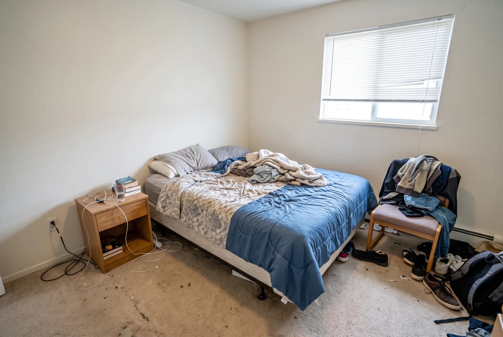
Clear surfaces matter as much as color. Keep nightstands to a lamp, a book and a glass of water, and give laundry and electronics a closed home. Choose a rug at least 24 inches (61 cm) wider than the bed on each side so your feet land on something soft. Hide chargers and standby lights, which glow in a dark room. More layout and furniture ideas live on our bedroom design page.
FAQ
What is the most calming color for a bedroom?
Muted sage, dusty blue and warm greige are the safest picks because they are low in saturation and easy to pair with wood and white bedding. The best one depends on your light: warm greige or sage in north-facing rooms, dusty blue in sunny south-facing rooms.
Will painting my bedroom fix my sleep problems?
No. Wall color can make a room feel calmer, but it is not a treatment for insomnia or any sleep condition. If poor sleep is ongoing, see a doctor.
Are dark bedroom walls a bad idea?
Not if the room gets decent daylight and you like a cocooned feel. Use a matte finish, paint the ceiling dark or mid-tone too, and keep bedding mid-tone so the room stays low contrast instead of stark.
What paint finish is best for a bedroom?
Matte or eggshell on walls, because flat finishes don't reflect lamp light into glare spots. Use satin or semi-gloss only on trim and doors, where durability matters more.
What color temperature bulbs should I use in a bedroom?
Around 2700K, ideally on dimmers. Warm light flatters muted wall colors, and bedside lamps at low brightness feel calmer in the evening than a bright overhead fixture.
RivAI Team
We build RivAI, the AI home design app for iPhone, at PixelPort LLC. RivAI is our product, so read our picks with that in mind: we take no payment for placements, and every product claim is checked against the app. About us · Editorial policy.
Published · Last updated
- #bedroom
- #color palettes
- #sleep
- #paint colors
Keep reading
 Inspiration
Living room color ideas: 12 palettes with hex codes
Twelve living room color palettes with hex codes, grouped from warm neutrals to the earthy browns paint brands picked for 2026. Each one notes the light and room size it suits.
· 11 min read
 Inspiration
The 60-30-10 rule: how to split colors in any room (with palettes)
The 60-30-10 rule splits a room into a dominant, a secondary and an accent color. Here's what counts toward each share, how to build the palette, and four room palettes with hex codes.
· 11 min read
 Inspiration
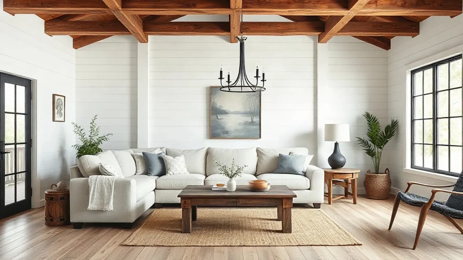
Modern farmhouse living room ideas: 15 warm, uncluttered looks
Fifteen modern farmhouse living room ideas grouped by walls, furniture, lighting, textiles and the warmer 2026 update. Each one comes with a size, bulb temperature or hex code, plus a short list of what to skip.
· 10 min read
Try this on your own room
Snap it, pick a style, see it redesigned in about 30 seconds.
Free to try · 3-day free trial on annual · Cancel anytime
