
The 60-30-10 rule: how to split colors in any room (with palettes)
By RivAI Team · · 11 min read
The short answer
The 60-30-10 rule is a decorators' rule of thumb for splitting color in a room: a dominant color covers about 60 percent of what you see (walls, rug, sofa), a secondary color about 30 percent (curtains, chairs, bedding, cabinets) and an accent the last 10 percent (cushions, art, lamps). Wood floors and white trim sit outside the count.
What is the 60-30-10 rule?
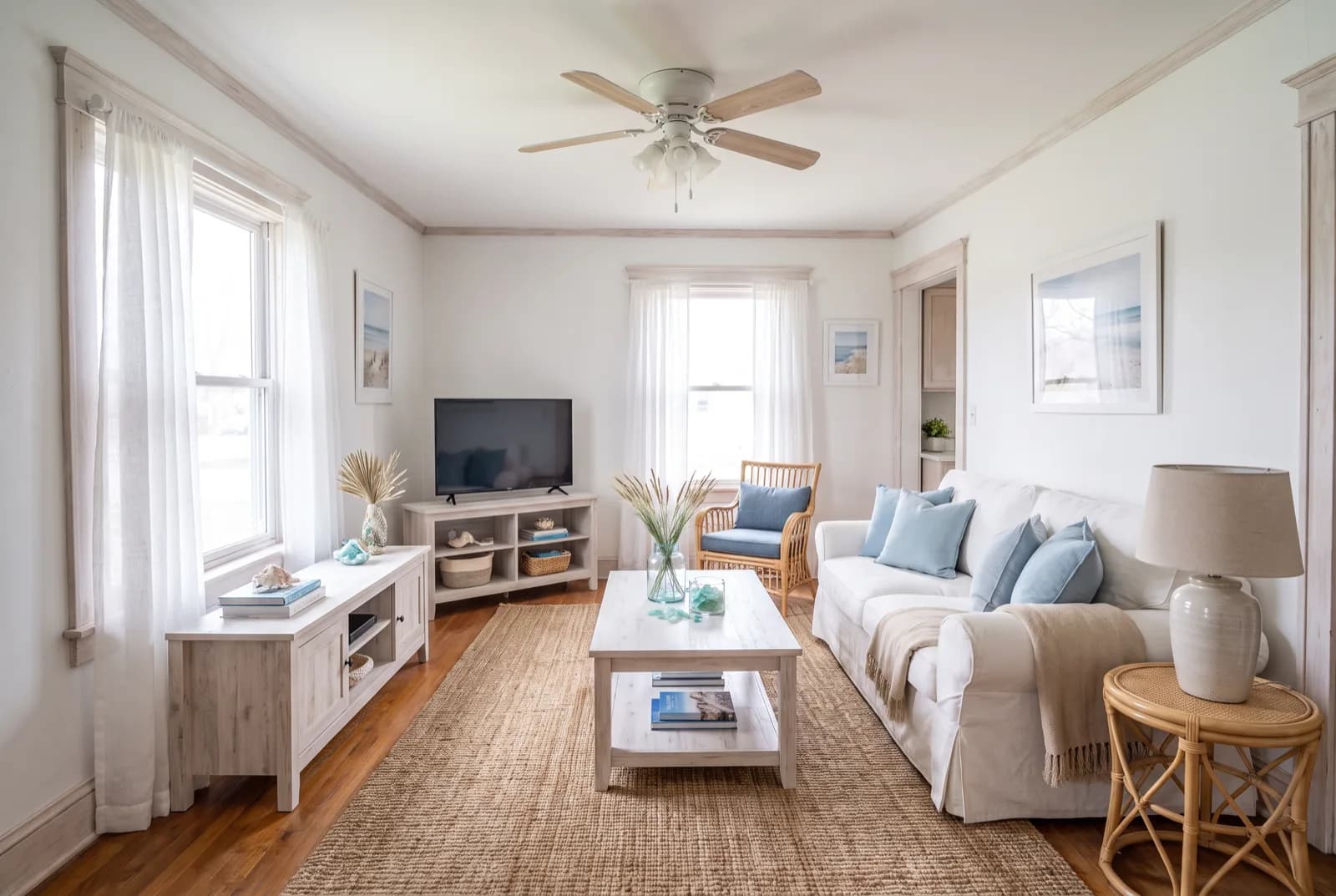
The 60-30-10 rule is a rule of thumb for splitting color in a room: one dominant color covers about 60 percent of what you see, a secondary color about 30 percent, and an accent color the last 10 percent. On the walls and the biggest pieces (a large rug, the sofa) you put the dominant color. Curtains, accent chairs, bedding or cabinetry take the secondary color. Accents are the small stuff: cushions, art, lamps, plants.
Unequal amounts give the eye a hierarchy, which is why the split works. One color sets the mood, a second adds depth, and a third gives you a few points of interest without the room turning busy. Measure by visible area rather than counting objects, and leave neutrals like wood floors and white trim out of the math. The trade-off: it's a starting ratio for people who don't trust their eye yet, and rooms that break it on purpose can look great.
Is the 60-30-10 rule real, and where does it come from?
Yes, as a guideline. Decorators have passed it around for a long time, and no single person or school can be credited with inventing it, so be wary of confident origin stories. Nothing in color science makes 60 percent the correct number. The figures are round because round numbers are easy to eyeball from a doorway.
A men's suit is the classic way to explain it: jacket and trousers are the 60, the shirt is the 30, the tie is the 10. Rooms work the same way. A calm base lets a small amount of strong color do its job.
Plenty of good rooms ignore the rule. Monochrome rooms, rooms that use two colors in near-equal amounts at very different lightness, and pattern-heavy rooms all break it on purpose. Some interior design styles lean one way by default: Scandinavian rooms tend toward a bigger white base, while bohemian rooms spread color through textiles. Use the rule for your first palette, then bend it.
What counts toward the 60, the 30 and the 10 in a real room?
Count what you see from the doorway, by area. A sofa covers far more of your view than six cushions, and four walls outweigh almost everything else, so big flat surfaces fill the 60 fast.
| Share | Typical surfaces | Color character |
|---|---|---|
| 60 (dominant) | Walls, a large area rug, the sofa or bed, big built-ins painted the wall color | Calm, usually lighter or muted: the color you'd happily look at every day |
| 30 (secondary) | Curtains, accent chairs, kitchen or bathroom cabinetry, bedding, an accent wall, a smaller rug | Contrasts with the 60 in lightness or temperature |
| 10 (accent) | Cushions, throws, art, lamps, vases, plants, a painted front door | The boldest or most saturated color in the room |
| Neutral frame (not counted) | Wood floors, white trim and ceiling, black or brass hardware, glass, white or gray stone counters | Holds the scheme together; count it only when it covers a big share of the room |
How do you count wood floors and white trim?
Leave them out of the count, mostly. A mid-tone oak floor and white trim behave like a picture frame: they show up in almost every room and don't compete with the scheme. There are two exceptions. If wood covers the floor, the ceiling beams and the cabinets, it's taking so much of the room that it's effectively your 60 or 30, so build around it. Paint the trim the wall color, and it simply joins the 60.
Watch bright white trim against a dark wall. That contrast outlines every door and window, which reads as an extra accent. If you'd rather it didn't, choose a white with a little of the wall color in it, or paint the trim a step lighter than the wall.
How do you build a 60-30-10 color palette for your home?
Start with what's staying, then work from the biggest surface to the smallest. This order saves the most repainting.
- Name the fixed pieces. The floor, a sofa you aren't replacing, a kitchen countertop, a rug you love. They set the temperature (warm or cool) that every other color has to agree with.
- Pick the 60 color first, and keep it quiet. Think soft white, greige, pale green or muted blue. Starting from nothing? The free 60-30-10 palette generator gives you a five-color palette with hex codes, already ordered for the split.
- Choose the 30 for contrast in lightness. Go two or three steps away from the 60 on a paint strip, darker or lighter, so the two don't blur into one.
- Pull the 10 from something you own. A painting, a rug or a favorite vase often holds the accent you already like, and this is the one place a saturated color is safe.
- Assign surfaces on paper. Write each color next to the things it'll cover. If the accent list is longer than the secondary list, you've got the shares backward.
- Test real paint, big. Paint sample boards at least 12 x 12 in (30 x 30 cm), tape them to two different walls, and look at them in morning light and under your evening bulbs.
- Check the LRV. Light reflectance value runs from 0 (black) to 100 (white) and is printed on most chips. As a rule of thumb, keep the 60 color above about 50 in a dim room so the walls don't swallow the light.
- Do a grayscale check. Photograph the samples side by side and switch the photo to black and white. Three colors that turn into the same gray need more contrast.
What do 60-30-10 palettes look like in each room?
These four palettes follow the same pattern: a quiet 60, a contrasting 30, one saturated 10, and a neutral that sits outside the count. Swap any hex for the paint chip closest to it.
Living room: coastal
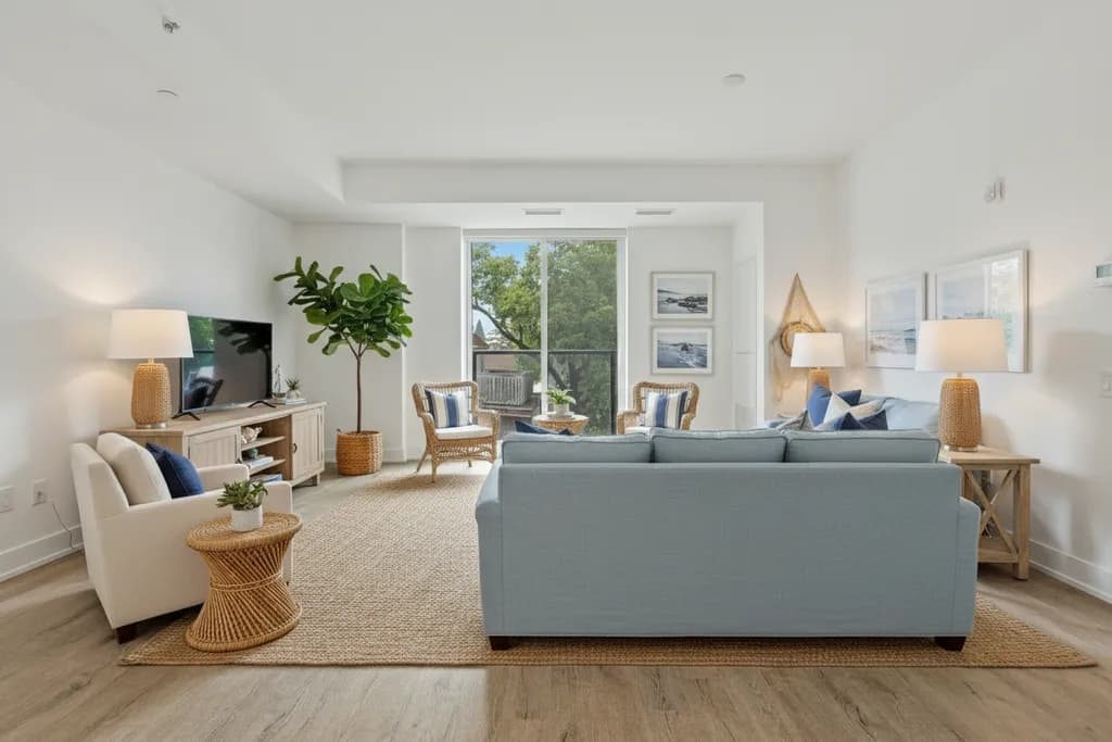
A coastal scheme makes the split easy to see. Soft white walls carry the 60, a blue-gray sofa and curtains carry the 30, and clay coral shows up in three spots: a pair of cushions, a vase and one print. Oak floors stay outside the count. In a small room keep the 60 this light; small living room ideas covers the layout side, and these living room color ideas give 12 more palettes to split this way.
See these colors on your own walls: Try this palette in RivAI
Bedroom: soft sage
Bedrooms suit lower contrast, with the 30 on the bed itself so the biggest object in the room holds the secondary color. Mushroom walls, sage bedding and curtains, and ochre in a throw and a lamp keep it soft. For more schemes built around rest, see bedroom color palettes for sleep.
See these colors on your own walls: Try this palette in RivAI
Kitchen: green base cabinets
Kitchens are mostly cabinets, so decide which cabinets belong to which share. Warm white walls and upper cabinets make the 60; deep green base cabinets and the island make the 30; brass hardware, pendants and stool seats make the 10. A butcher-block counter reads as neutral wood.
See these colors on your own walls: Try this palette in RivAI
Bathroom: navy vanity
Tile usually supplies the 60 in a bathroom. Here that's pale stone tile and walls, a navy vanity for the 30, and rust towels, a soap dish and a small print for the 10. White fixtures and chrome stay neutral.
See these colors on your own walls: Try this palette in RivAI
How is the 60-30-10 rule different from 70-20-10, 50-30-20 and monochrome?
All four share one idea: unequal amounts of color, with one clear leader. They differ in how much contrast they let in. 70-20-10 is the calmer cousin, 50-30-20 gives the accent far more room, and monochrome swaps three colors for one hue in light, medium and dark versions.
| Split | How it divides color | Feels | Good for | Watch out for |
|---|---|---|---|---|
| 60-30-10 | One dominant, one secondary, one accent | Balanced | First palettes, living rooms, bedrooms | An accent so timid it disappears |
| 70-20-10 | Bigger dominant share, smaller secondary | Calm, airy | Small rooms, rentals, Scandinavian or minimalist rooms | Looks flat if the 70 is plain white with no texture |
| 50-30-20 | Smaller dominant, a much bigger accent | Lively, bold | Dining rooms, kids' rooms, eclectic or bohemian rooms | Gets busy fast if all three colors are saturated |
| Monochrome | One hue in light, medium and dark versions, often split roughly 60-30-10 by lightness | Quiet, enveloping | Bedrooms, studies, color-drenched rooms | Needs texture (linen, wood, wool) or it goes flat |
Pick 70-20-10 if color makes you nervous, 60-30-10 if you want a clear scheme, and 50-30-20 only if you love the accent enough to see a lot of it.
What mistakes do people make with the 60-30-10 rule?
- Splitting two strong colors 50-50. Equal amounts of saturated complements, like red and green or blue and orange, seem to vibrate where they meet; let one lead and mute the other.
- Counting objects instead of area. Ten small blue things can add up to less blue than one blue sofa.
- Using the accent once. A single coral cushion looks like an accident, so repeat the 10 in three spots across the room.
- Choosing three colors of the same lightness, which turns to mush at dusk and in photos.
- Picking the 60 under store lighting. Your room's light is different, and north-facing rooms pull colors cooler and grayer, so read paint colors for north-facing rooms before you commit.
- Treating the numbers as exact. Nobody measures; a room that feels balanced at 65-25-10 is balanced.
How can you preview a 60-30-10 split on your own room?
Paint chips show one color at a time, and the rule is about how three colors share a room, so the useful test is a picture of your own room with the split applied. In RivAI, take a photo, pick the room type and a style, then choose one of the six built-in palettes (Warm Earth, High Contrast, Laid-back Blues, Forest Hues, Terracotta or Soft Pastels) to steer the redesign. Keep Structure holds the walls, windows and layout in place.
To test exact colors, open the Paint tool, choose a surface (walls, ceiling, cabinets, doors or trim) and type the hex code from your chip into the iOS color picker. Put your 60 on the walls, then edit the result again to add the 30 to the cabinets. Each Standard render takes about 30 seconds, and the before/after slider shows the change side by side.
Some honest limits: you get 2 free designs per install, free results carry a watermark, and the app runs on iPhone and iPad only. Screen colors also aren't paint chips. Displays shift color, so use the preview to choose a direction and a real sample board to make the final call.
FAQ
Is the 60-30-10 rule the same as the golden ratio?
No. The golden ratio is about 1.618 to 1, while 60 to 30 is 2 to 1 and 30 to 10 is 3 to 1. Both rest on a loose shared idea, that unequal proportions look more settled than equal ones, which is probably why people mix them up. The 60-30-10 numbers are round so you can eyeball them.
What does the 60-30-10 rule actually do for a room?
It sets a pecking order. One color fills most of the room so your eye has somewhere to rest, a second adds contrast so the room doesn't look flat, and a small accent gives the eye a few places to land. Without that order, three colors in equal amounts compete and the room feels busy.
What two colors should not be seen together?
There's no banned pair, but equal amounts of two saturated complements, like red and green at 50-50, seem to vibrate where they meet. The fix is proportion: make one of them the 60 or 30, mute it, and keep the other as a small accent. A red berry against green leaves works for exactly that reason.
What is the 3-5-7 rule in decorating?
It's a grouping guideline: arrange decorative objects in odd numbers, usually 3, 5 or 7, since odd groups tend to read as more relaxed than matched pairs. Vary the heights and keep one shared thread, such as color or material. It pairs well with 60-30-10: group your accent pieces in threes and spread those groups around the room.
Does the 60-30-10 rule work in an open-plan space?
Yes, if you treat the whole open area as one room for the 60 and 30, so walls and big pieces stay consistent from the kitchen to the sofa. Each zone can have its own accent if you like, but repeat at least one accent color across zones so the space reads as one room.

RivAI Team
We build RivAI, the AI home design app for iPhone, at PixelPort LLC. RivAI is our product, so read our picks with that in mind: we take no payment for placements, and every product claim is checked against the app. About us · Editorial policy.
Published · Last updated
- #color palettes
- #60-30-10 rule
- #paint colors
- #design rules
Keep reading
 Inspiration
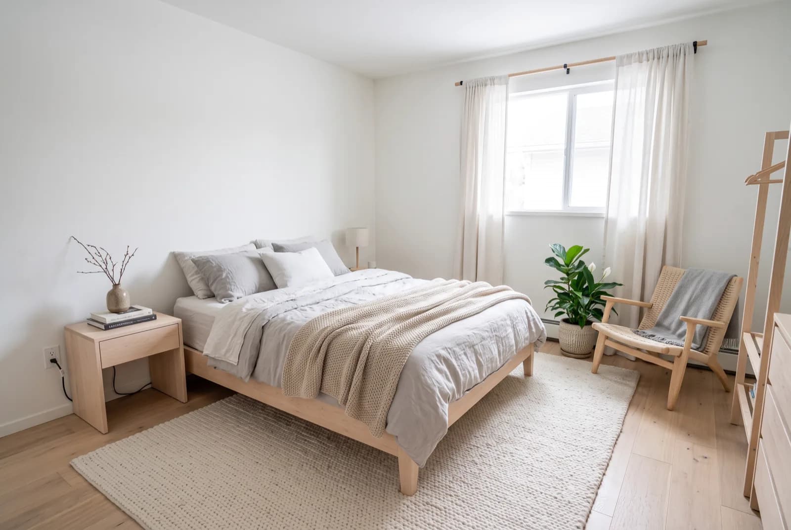
Bedroom color palettes that help you sleep
Five restful bedroom palettes with exact hex codes, and the details that matter as much as the color: contrast, finish, darkness and warm light.
· 5 min read
 How-to
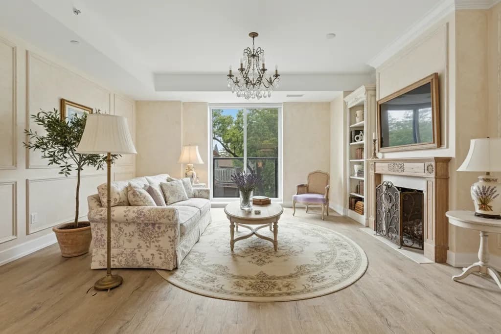
How to pick paint colors for a north-facing room
North light is cool, soft and steady, which makes the wrong white look gray. Here is how to choose undertones, depth and bulbs that work with it.
· 7 min read
 Inspiration
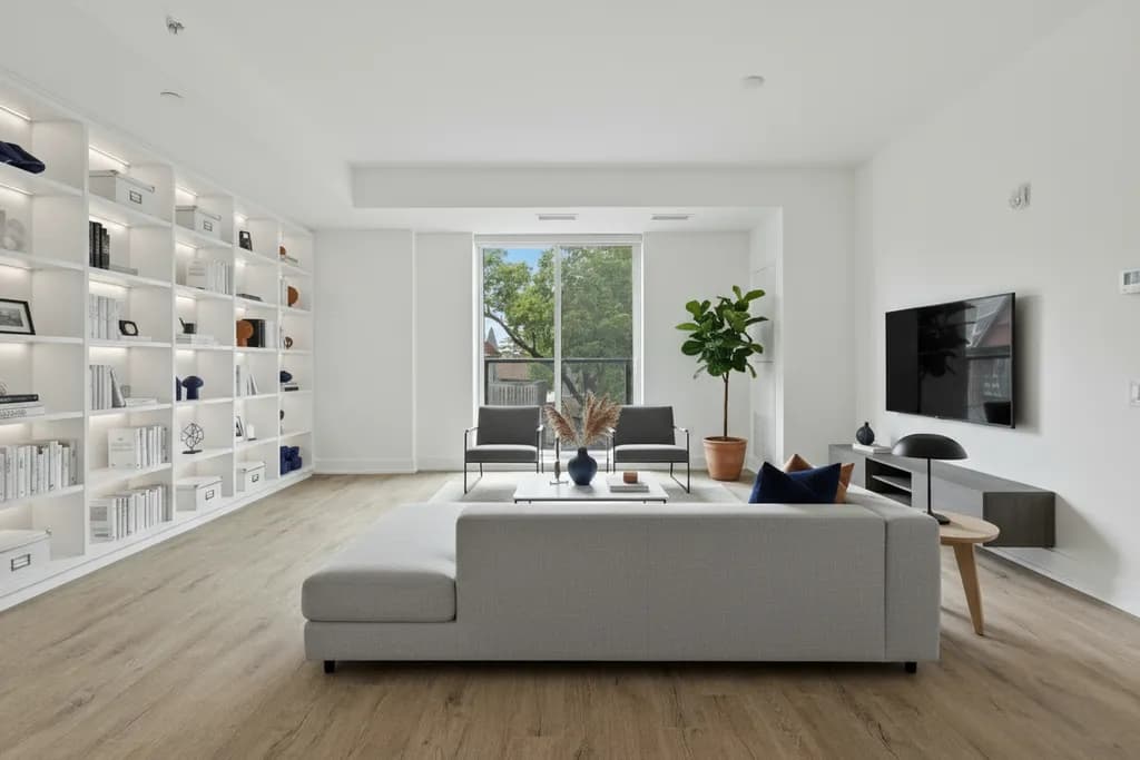
10 small living room ideas that make the space feel bigger
A small living room feels bigger when you fix circulation, light and sightlines. These 10 ideas come with the exact measurements to get them right.
· 7 min read
Try this on your own room
Snap it, pick a style, see it redesigned in about 30 seconds.
Free to try · 3-day free trial on annual · Cancel anytime
