
Guide
How to choose paint colors for any room
By RivAI Team at PixelPort LLC · Published · How we write guides
The short answerChoose a paint color by deciding the room's mood, matching undertones to fixed finishes like flooring and counters, checking the Light Reflectance Value for your light levels, and testing large swatches for a few days. AI tools like RivAI let you preview exact hex colors on a photo of your room before buying a sample pot.
Why should you start with mood, not with a color deck?
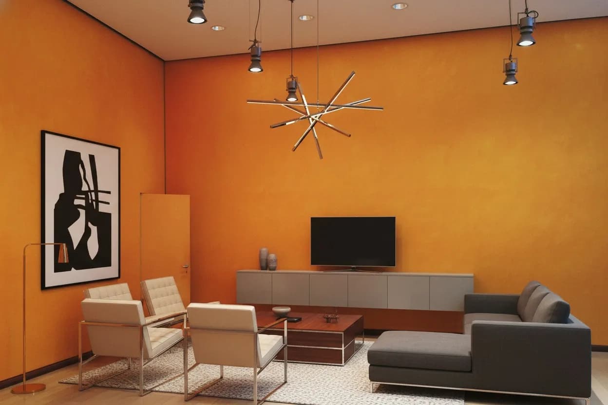
Every successful paint decision starts with a feeling: calm bedroom, energetic kitchen, focused office. Warm hues such as reds, oranges, and yellow-based neutrals visually advance and energize; cool hues such as blues, greens, and violet-based grays recede and calm. Decide the mood first and you eliminate most of the color deck before you look at a single swatch.
What are undertones and why do they matter?
Every neutral has an undertone: a hidden hue that reveals itself once paint covers a whole wall. A gray can lean blue, green, purple, or brown; a white can lean warm (cream) or cool (blue). Undertones clash when they fight your fixed finishes, so always judge swatches against flooring, countertops, and trim rather than on their own.
- Beige with pink undertones next to yellow-oak flooring reads muddy.
- Cool blue-grays can make warm wood furniture look orange by contrast.
- Green-undertone whites pair well with plants, rattan, and natural linen.
- When in doubt, compare two swatches side by side; undertones are easiest to see in comparison.
What is LRV and how light should you go?
Light Reflectance Value (LRV) measures how much light a color bounces back, on a scale from 0 (pure black) to 100 (pure white). Rooms with little natural light generally want wall colors with an LRV of 60 or higher to stay bright; sun-drenched rooms can handle colors down to an LRV of 30 without feeling cave-like. Most paint brands publish LRV on the swatch or their website.
- LRV 70-100: airy whites and pastels; best for small or north-facing rooms.
- LRV 50-70: soft mid-tones; safe for most living spaces.
- LRV 30-50: saturated mid-colors; use on accent walls or well-lit rooms.
- LRV 0-30: deep, dramatic colors; best as accents or in large bright rooms.
Warm vs cool: which direction suits your room?
Warm palettes (cream, terracotta, honey, warm gray) make large or sparse rooms feel intimate and welcoming. Cool palettes (blue, sage, slate, crisp white) make small or sun-baked rooms feel fresh and airy. The direction should answer the mood question from step one, and it must agree with your fixed finishes: warm wood floors want warm or neutral walls, while cool gray tile tolerates cooler paint. If your finishes mix warm and cool, a balanced neutral with a soft green or greige undertone is the safest bridge.
How does lighting direction change a color?
The same paint looks different in every room because of compass direction and the color of daylight. Check swatches in the morning and evening before committing.
| Room faces | Light quality | Colors that work | Colors to avoid |
|---|---|---|---|
| North | Cool, bluish, consistent | Warm whites, yellows, warm grays | Icy blues and cold grays |
| South | Warm and bright all day | Almost anything; cool colors balance the warmth | Very pale colors can wash out |
| East | Warm morning, cool afternoon | Soft greens and warm neutrals | Heavy reds can glare at breakfast |
| West | Cool morning, golden evening | Warm neutrals and earthy tones | Flat grays look dull until sunset |
How do paint colors affect mood and sleep?
Color psychology is softer science than LRV, but broad patterns hold up in practice. Blues and greens consistently read as calm and suit bedrooms and bathrooms. Warm neutrals feel social and forgiving, so they dominate living rooms. Saturated reds and oranges stimulate appetite and energy, which is why they appear in dining rooms and kitchens but rarely in bedrooms. Very dark bedrooms can aid sleep for some people and feel oppressive to others; this is exactly the kind of personal call where previewing the exact color on your own walls beats generic advice.
Does the same color work in every room?
No, because light and function differ. A greige that looks sophisticated in a south-facing living room can turn drab in a north-facing study. Treat each room as its own problem: set the mood goal, check the LRV against the room's daylight, respect the fixed finishes, then test. The 60-30-10 rule and shared undertones keep the whole home coherent even when no two rooms share a color.
What is the 60-30-10 rule?
Designers balance color with the 60-30-10 rule: about 60 percent of the room (walls, large rugs, big furniture) carries the dominant color, 30 percent (curtains, accent chairs, bedding) carries a secondary color, and 10 percent (cushions, art, lamps) carries an accent. The rule keeps bold choices livable because the eye always has a calm majority to rest on. A worked example: soft white walls and a beige sofa (60), sage curtains and a sage armchair (30), and terracotta cushions, a lamp, and one piece of art (10). Swap only the 10 percent layer seasonally and the room feels refreshed for almost no money.
How should you test paint before committing?
- Narrow down to three candidates and buy sample pots or large peel-and-stick swatches.
- Paint swatches of at least 60 x 60 cm on two different walls, or move peel-and-stick samples around the room.
- Look at the swatches in morning, midday, and evening light, plus with lamps on at night.
- Live with them for at least three days; first impressions of bold colors soften fast.
- Preview the finalists digitally: in RivAI, use the Paint tool to apply the exact hex code to the walls in a photo of your actual room and compare options with the before/after slider.
Can AI help you choose paint colors?
Yes, as a first filter. RivAI's Paint tool recolors one surface, such as the walls, ceiling, cabinets, doors or trim, in a photo of your real room using an exact color. Start from the app's 12 curated swatches, or type a hex code into the iOS color picker; if a paint brand publishes a hex value for a color, you can enter it yourself, though the app does not include brand paint catalogs. Screens and daylight shift color, so use the preview to narrow the shortlist, then confirm with a real sample on the wall.
Which paint finish should you choose?
Color gets the attention, but sheen decides how the color lives. Higher sheen reflects more light, shows more wall imperfections, and scrubs cleaner; lower sheen hides flaws and reads softer. Match the finish to the room's traffic:
| Finish | Look | Durability | Best rooms |
|---|---|---|---|
| Matte / flat | Soft, velvety, hides flaws | Low; marks easily | Adult bedrooms, ceilings |
| Eggshell | Slight glow | Moderate | Living rooms, dining rooms |
| Satin | Noticeable sheen | Good; wipeable | Kitchens, kids' rooms, halls |
| Semi-gloss | Bright and reflective | High; scrubbable | Trim, doors, bathrooms |
How do you build a whole-home palette?
Rooms should feel related even when they are not the same color. A simple method keeps the whole home coherent:
- Pick one neutral with a clear undertone as the connective base for halls and shared spaces.
- Choose two or three satellite colors that share that undertone, one per private room.
- Assign each room a depth: lighter where you pass through, deeper where you linger.
- Repeat one accent color in small doses across rooms so the eye finds a thread.
- Preview each pairing in RivAI by painting the walls in photos of two adjacent rooms with the exact hex codes and checking they flow together.
What are the most common paint mistakes?
- Choosing a color from a tiny chip under store lighting.
- Ignoring the undertones of fixed finishes like floors and counters.
- Going too dark in rooms that are starved of daylight.
- Skipping the multi-day test because the first coat looked good.
Put this guide to work: paint color visualizer, paint colors for a north-facing room, bedroom color palettes for sleep, living room color ideas and the 60-30-10 color rule.
Related
FAQ
What is the most foolproof paint color strategy?
Pick a warm or cool neutral with an LRV above 60 for walls, follow the 60-30-10 rule for accents, and test large swatches for three days. Previewing the exact hex code on a photo of your room in an app like RivAI helps you narrow the shortlist before you buy samples.
Should all rooms in a home be the same color?
Not necessarily, but they should share undertones. Using one neutral family at different depths, lighter in halls and deeper in bedrooms, creates flow without monotony. Bold accent rooms work best when they connect back to the neutral through textiles or art.
How do I find the hex code of a paint color?
Most major paint brands publish hex or RGB values on their websites, and color-matching apps can extract a hex from a photo of a swatch. Once you have it, enter it in the iOS color picker inside RivAI's Paint tool to preview that color on your walls. Treat the render as a guide and confirm with a physical sample.
Do dark colors really make a room look smaller?
Low-LRV colors absorb light and visually advance walls, so small dim rooms can feel tighter. But in rooms with strong daylight or high ceilings, dark walls add depth and coziness without shrinking the space. Test on your actual room before judging.
What order should I choose colors in?
Start with fixed elements you cannot change, such as flooring, counters, and large furniture, then pick a wall color that matches their undertones, then layer accents with the 60-30-10 rule. Paint is the cheapest element to change, so it should adapt to everything else, not the reverse.
Last updated 2026-10-09
Try it on your own room
Snap it, pick a style, see it redesigned in about 30 seconds.
Free to try · 3-day free trial on annual · Cancel anytime
