
Living room color ideas: 12 palettes with hex codes
By RivAI Team · · 11 min read
The short answer
The best living room color ideas start with your light. South-facing rooms handle cool greens and blues; north-facing rooms look better in warm whites, khakis and terracotta. Pick one wall color, one darker accent and one trim color, then test samples on white foam board for a full day before you commit.

What are the best living room color ideas?
The best living room color ideas fall into four families: warm neutrals (soft white, greige, mushroom), greens and blues (sage, eucalyptus, slate), deep moody shades (charcoal, ink, forest green) and the earthy browns and khakis that paint brands picked for 2026. Which one suits you depends on three things: how much daylight the room gets, its size, and what you already own, like the floor and the sofa. For layout and furniture beyond paint, see our living room design ideas.
A practical rule: north-facing and small rooms do better with warm, lighter walls, while bright south- or west-facing rooms can carry cool or dark colors without turning gloomy. Most living rooms need only three colors, a wall shade, a darker accent and a trim color, and the 12 palettes below give you each with hex codes. Test your favorite on a large sample board in morning and evening light before you buy gallons.
Which warm neutral colors work in a living room?
Warm neutrals are the safest living room paint colors: they flatter skin, wood and most fabrics, and they forgive mixed lighting. Look for a yellow, pink or red undertone on the chip. All three palettes here work in almost any orientation, and they're the first place to look if your room is small or faces north (our guide to paint colors for north-facing rooms goes deeper).
1. Warm white and pale oak
Pick this if the room is small, dark or north-facing. A warm white with a hint of yellow keeps walls from reading gray in weak light. For trim, Sherwin-Williams' Pure White SW 7005 has a published hex of #EDECE6 and an LRV of 83.957, so it bounces back most of the light that hits it. Our layout tips in small living room ideas pair well with this palette.
See these colors on your own walls: Try this palette in RivAI
2. Greige with charcoal accents
Greige (gray plus beige) is the bridge color for a room with a gray floor or a cool-toned sofa you aren't replacing. It reads warm in a south-facing room and stays neutral facing east. Go for a mid-light version on the walls of a medium or large room, and let charcoal do the contrast in frames, a lamp base and the TV wall.
See these colors on your own walls: Try this palette in RivAI
3. Mushroom, cream and rust
Mushroom is a gray-brown with more body than greige, and it makes a large, bright living room feel cozier and more enclosed. East-facing rooms suit it, because its warmth balances the cooler light they get after noon. Keep the ceiling cream so it doesn't press down, and bring rust in through one chair or a rug.
See these colors on your own walls: Try this palette in RivAI
Which greens and blues suit a living room?
Greens and blues need more light than neutrals. In a bright south- or west-facing room they look fresh; in a dim north-facing one the same chip can turn gray and cold, so warm the undertone (a sage with yellow in it, a blue with a drop of green) or go a step lighter.
4. Sage green, cream and orange
Sage is the easiest green to live with. It sits next to wood, linen and leather without fighting any of them, and a few orange cushions give it a complementary kick (the cover image shows this mix). Rooms of any size can take it; in a north-facing room, choose a yellower sage than the one below.
See these colors on your own walls: Try this palette in RivAI
5. Muted eucalyptus and terracotta
Eucalyptus is grayer and bluer than sage, closer to a dusty leaf. Paired with terracotta, it gives a calm Mediterranean feel that suits a bright living room full of plants. Keep it out of small north-facing rooms, where it slides toward gray; it's at its best on a sunny wall above warm wood floors.
See these colors on your own walls: Try this palette in RivAI
6. Slate blue and camel
Slate blue is a grayed, grown-up blue that looks good on every wall of a large south- or west-facing room. Camel leather and warm white trim stop it feeling chilly. If your room only gets cool northern light, use this palette on the wall behind the sofa or switch to the warm neutrals above. For bedrooms, where calm matters more than contrast, our bedroom color palettes for sleep go softer.
See these colors on your own walls: Try this palette in RivAI
Which deep, moody colors work in a living room?
Dark living room paint colors work best in rooms you use mostly at night, or in rooms with enough daylight to carry the depth. The trick is to paint more surfaces, not fewer: walls, trim and even the ceiling in the same deep shade (color drenching) blur the corners, so the room feels wrapped instead of boxed in.
7. Charcoal, warm white and cognac
Soft black or deep charcoal on the walls makes art, brass lamps and pale upholstery glow. Sherwin-Williams' Tricorn Black SW 6258 is a near-black with a published hex of #2F2F30 and an LRV of 2.849, which tells you it absorbs almost all the light that lands on it. Use it on a TV or fireplace wall, or drench a small den. Balance it with cognac leather and plenty of warm 2700K lamp light.
See these colors on your own walls: Try this palette in RivAI
8. Ink blue and ochre
Ink blue reads almost black at night and deep navy by day, which makes it a good choice for a west-facing living room that gets warm evening light. Ochre and mustard bring the warmth back. In a large room, paint all four walls; in a small one, try it on the wall behind the sofa first.
See these colors on your own walls: Try this palette in RivAI
9. Forest green and oxblood
Deep green with an oxblood accent has a library feel, and it works best in a mid-size or large room with at least one good window. Brass and dark wood suit it. Matte walls make the green look velvety, while any shine shows roller marks on a color this dark.
See these colors on your own walls: Try this palette in RivAI
What is the in-color for a 2026 living room?
Paint brands are betting on warm browns for 2026. Benjamin Moore named Silhouette AF-655 its Color of the Year 2026 on October 16, 2025, and Pittsburgh Paints Co. (PPG) chose Warm Mahogany PPG1060-7 for its 2026 pick on August 26, 2025. Sherwin-Williams' Universal Khaki SW 6150 sits in the same earthy lane. Our read: the cool grays of the last decade are giving way to warmer, slightly muddier colors.
10. Silhouette brown and cream
Silhouette is a deep brown with a charcoal cast, and its LRV of 10.18 puts it firmly in dark territory. Benjamin Moore doesn't publish a hex, so the swatch below is an approximate tone for screen use only. Treat it like the moody palettes: a bright room, a drenched den, or one wall behind the sofa.
See these colors on your own walls: Try this palette in RivAI
11. Universal Khaki and white oak
Universal Khaki is the friendliest of these earthy picks for an everyday living room. Sherwin-Williams publishes a hex of #B8A992 and an LRV of 40.478, so it's a true mid-tone: dark enough to feel warm, light enough for a medium room facing any direction. Pair it with white oak and black metal.
See these colors on your own walls: Try this palette in RivAI
12. Warm Mahogany with clay and linen
Warm Mahogany is a red-brown, and painting a whole room in that shade takes nerve. Try it on the back of a bookcase, a fireplace surround or the lower half of a wall below a picture rail, with clay above. The swatch below is our approximate tone, not an official hex.
See these colors on your own walls: Try this palette in RivAI
How do you build a living room color scheme that works?
Start with what you can't change (the floor, the sofa, the kitchen cabinets in an open plan), then pick a scheme and a split. A good rule of thumb is the 60-30-10 color rule: roughly 60 parts main color on the walls, 30 parts secondary in the sofa, rug and curtains, and 10 parts accent. For a longer walkthrough of undertones and LRV, see how to choose paint colors.
What are the 7 color schemes?
| Scheme | How it works | Living room example |
|---|---|---|
| Monochromatic | One hue in light, mid and dark values | Pale sage walls, mid-sage sofa, deep green velvet chair |
| Analogous | Three neighbors on the color wheel | Olive walls, teal cushions, slate blue rug |
| Complementary | Two opposites on the wheel | Slate blue walls with rust cushions and a camel chair |
| Split-complementary | One hue plus the two neighbors of its opposite | Ink blue walls with terracotta and ochre accents |
| Triadic | Three hues spaced evenly around the wheel | Muted brick, mustard and denim, all dulled down |
| Tetradic (square) | Four hues, two complementary pairs | Forest green walls, with oxblood, navy and ochre in small doses |
| Neutral | Whites, beiges, grays and browns with no strong hue | Warm white walls, greige sofa, walnut wood, black lamps |
Monochromatic and neutral schemes are the easiest to get right. Triadic and tetradic need a confident hand and real restraint, so let one hue dominate and keep the others small. If you'd like to play with combinations before buying samples, the palette generator is a quick sandbox.
Which sheen goes where?
- Walls: matte or flat. It hides dents and roller marks and makes dark colors look rich. Choose eggshell instead if kids or pets touch them, because it wipes clean.
- Trim, doors and window frames: satin or semi-gloss, which stands up to scuffs and gives a crisp edge.
- Ceilings: flat, always.
- Skip gloss on living room walls. Every bump in the plaster shows.
How should you test samples?
Benjamin Moore's advice is to paint 8 oz samples onto white foam board and watch them through the day as sun and shade move. That page is about exteriors, but the method works just as well indoors. Here's a routine for a living room:
- Narrow it to three candidates per wall color. Past that, they blur together.
- Paint each board with two full coats, edge to edge, ideally at least 2 x 3 ft (60 x 90 cm).
- Tape the boards next to the trim and near the floor on the window wall and in the darkest corner.
- Look at them at 9 am, at noon and after dark with the lamps on.
- Check each one beside your sofa fabric and floor, since those won't change.
- Live with the winner for two days before you buy gallons.
How can you preview a color on your own living room?
Sample boards show the real paint; a photo preview shows the whole room. In RivAI's Paint tool, you start from a photo of your living room, choose the surface (walls, ceiling or trim), then open the iOS color picker and type the hex code from the color page or paint chip. A Standard result takes about 30 seconds, and the before/after slider lets you compare it with your original photo.
To restyle the whole room around a color mood instead, the Interior redesign tool lets you steer the result with one of six palettes: Warm Earth, High Contrast, Laid-back Blues, Forest Hues, Terracotta or Soft Pastels. The paint color visualizer page shows how the Paint tool works step by step.
What should you skip?
Some popular moves end in a second paint job.
- Picking from a tiny chip under store lighting. Shop lights and your 2700K lamps at home show two different colors.
- Cool gray in a north-facing room. It goes flat and blue.
- Accent walls everywhere. One is plenty, and it belongs behind the focal point (sofa, fireplace or TV) rather than on the wall with the door.
- Chasing a color of the year into the wrong room: a deep brown like Silhouette in a small, single-window, north-facing living room feels like a cave unless you drench it on purpose.
- Painting before you've chosen the sofa and rug. Paint comes in far more colors than fabric does, so pick the fabric first and match the walls to it.
FAQ
How does lighting affect paint color?
Direction and bulbs both shift it. North light is cool and even, so warm undertones help; south light is warm and strong, so cool colors stay fresh. Indoors, a good rule of thumb is 2700K bulbs for a cozy living room and no higher than 3000K, since 4000K lamps push warm colors toward gray and make whites look clinical.
What are good paint colors for a kitchen and living room in an open plan?
Use one wall color through the whole open space so it reads as one room, usually a warm neutral or a mid-tone like khaki. Then separate the zones with things that aren't wall paint: cabinet color, a rug, a darker island. Keep the same trim white everywhere so the edges line up visually.
How many paint colors should a house have?
Three to five coordinated colors suits most homes, in our view: one main wall color, one or two room accents, one trim white and maybe a ceiling shade. Repeating the same white and the same main neutral from room to room keeps the house feeling connected, even when a bedroom or den goes darker.
What color makes a house look expensive?
In our opinion, colors with depth and a little gray or brown in them (mushroom, khaki, deep green, ink blue) look more expensive than bright, clean primaries. Finish counts too: matte walls, crisp satin trim and one consistent white across the house read as deliberate. Rooms look cheaper when they mix too many unrelated colors.

RivAI Team
We build RivAI, the AI home design app for iPhone, at PixelPort LLC. RivAI is our product, so read our picks with that in mind: we take no payment for placements, and every product claim is checked against the app. About us · Editorial policy.
Published · Last updated
- #paint colors
- #living room
- #color palettes
- #2026 colors
Keep reading
 How-to
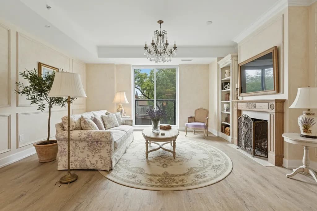
How to pick paint colors for a north-facing room
North light is cool, soft and steady, which makes the wrong white look gray. Here is how to choose undertones, depth and bulbs that work with it.
· 7 min read
 Inspiration
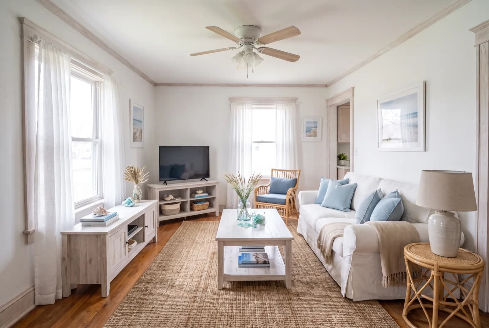
The 60-30-10 rule: how to split colors in any room (with palettes)
The 60-30-10 rule splits a room into a dominant, a secondary and an accent color. Here's what counts toward each share, how to build the palette, and four room palettes with hex codes.
· 11 min read
 Inspiration
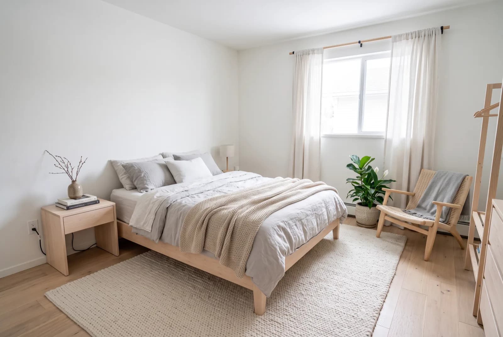
Bedroom color palettes that help you sleep
Five restful bedroom palettes with exact hex codes, and the details that matter as much as the color: contrast, finish, darkness and warm light.
· 5 min read
Try this on your own room
Snap it, pick a style, see it redesigned in about 30 seconds.
Free to try · 3-day free trial on annual · Cancel anytime
